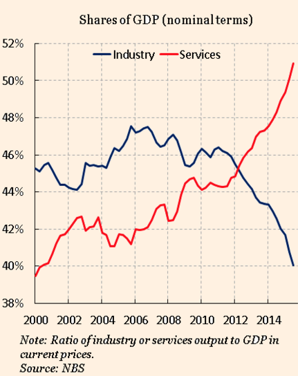
The Financial Times has a new piece on the Chinese economy, which contains a graph showing the striking shift toward a service economy:
However Gavyn Davies suggests that this graph is misleading, and also provides a graph showing the shares in “real” terms:
I put “real” in scare quotes for a reason, any data on share of GDP is already real data, and has no need to be adjusted for changes in the price level. The nominal share of GDP shows the share of economic activity devoted to the industry in question. In this case, the divergence probably results from much faster productivity growth in industry than services. Unfortunately, Davies seems to miss that point in this passage:
The optimists point to the rise in the share of services in nominal GDP, and the corresponding decline in industrial sectors, as shown in the above left graph. Measured in current prices, the rebalancing appears to be well underway, with the share of industrial sectors falling from 47 per cent in 2011 to 40 per cent now.
However, almost the whole of this rebalancing in nominal terms has occurred because of a large drop in the relative price of industrial products compared to services. In real, inflation adjusted terms (above right graph), there has been no rebalancing whatsoever in the past decade taken as a whole (though there has been a percent or two in 2014-15). The needed shift in real resources – labour and capital – out of the moribund sectors has therefore barely started.
No, labour is rapidly being shifted from agriculture and industry to services, where productivity is growing more slowly, and this will continue for many more decades.
That doesn’t mean all’s well with the Chinese economy, I think Davies is exactly right on this point:
The key question is whether China can restore confidence in its exchange rate policy, not least among its own citizens. For as long as a renminbi devaluation of unknown size continues to overhang the markets, an abatement in capital outflows, and a return to stability, seems difficult.
It is even possible that the event that markets most fear – a controlled depreciation of 10 per cent or so – might be the only way of restoring calm, if accompanied by other reforms. Until the renminbi is deemed by the global financial system to be at a sustainable level, fear of disruptive change will dominate sentiment.
The PBOC does not seem to agree.
Maybe they’ve been influenced by BIS warnings that “easy money” will lead to bubbles. In any case, the PBoC needs to ease monetary policy, by setting the exchange rate at a more realistic level.
HT: Tyler Cowen
READER COMMENTS
Ryan Murphy
Jan 17 2016 at 6:34pm
Maybe I am not following something, but how do differences in productivity growth explain the differences in the graphs?
Sometimes people use “real” to mean “PPP-adjusted” and I think that could also account for the discrepancy…?
Scott Sumner
Jan 17 2016 at 7:43pm
Ryan, Rapid productivity growth in industry tends to drive down prices relative to services. So nominal output in industry rises less rapidly than real output.
BC
Jan 17 2016 at 9:08pm
I understand the point about not using a different price deflator for industry and services; it’s the same economy and currency after all.
However, suppose we had two countries with free trade and a common currency: Industryland, which only had manufacturing, and Servicesland, which only performed services. In computing “real GDP” time series, wouldn’t we compute separate price deflators for each country? Would that be right for real GDP across time but wrong for comparing GDP of the two countries at a given time? If countries have different currencies with floating exchange rates and free trade, what is the “right” way to compute changes in shares of global output, current prices in a common currency? Would that be at market exchange rates or PPP?
ChrisA
Jan 18 2016 at 1:47am
The distinction between services and industrial output is largely semantic anyway, and varies between countries a huge amount. In many cases what is happening is that industrial output is being defined as services, depending on whether or not the service is inhouse or not. For instance the design of smart phones is now typically placed in the service category, since it is separated from the manufacturing in most cases. Is design of smart phones industrial or services? It is simply a matter of semantics. As countries get richer, they tend to have more and more specialization, which tends to mean more and more separate activities to produce the same product.
Benjamin Cole
Jan 18 2016 at 4:21am
By the way, the Hong Kong exchange is trading at an average PE of about 8.7. There are Hong Kong REITs offering 8.5% yields. I wonder if we will look back on this like we look back on the 1979 price of stocks in the US, then also in single-digit PEs.
Imagine collecting and 8% + dividend for the next 20 years while property prices quadruple. Many REITs and property trusts are selling for well below NAVs.
Mike Hammock
Jan 18 2016 at 10:41am
It’s not clear to me why the two graphs would be different at all, if the only data difference is real vs. nominal. Someone tell me where I’m going wrong here, as I’m clearly confused. I don’t have an FT subscription, so I can’t read the original.
Shares of GDP are just the dollar amount of output in a sector divided by GDP.
If they’re in nominal dollars, they’re contemporaneous dollars divided by contemporaneous dollars.
If they’re in real dollars, the numerator for each year is contemporaneous dollars multiplied by an adjustment for inflation (probably a ratio of GDP deflators). The denominator for each year is also contemporaneous dollars, multiplied by the same adjustment for inflation (the same ratio of GDP deflators, since it’s for the same year). The two adjustments for inflation should cancel out, giving the exact same ratio of contemporaneous dollars as the nominal calculation.
Clearly I am wrong about this. To put it another way, Scott Sumner says ‘I put “real” in scare quotes for a reason, any data on share of GDP is already real data, and has no need to be adjusted for changes in the price level.’ I agree, but to me this means the two graphs should be identical. What procedure is being used to create the second graph?
ThomasH
Jan 18 2016 at 11:59am
Exchange rate management is almost always a bad idea. The PBoC’s reluctance to see a substantial devaluation is a sign of poor macroeconomic management. Of course “Macromedia” agree with BBoC that the exchange rate is a “big problem,” but they opposed QE, too, so what can one expect.
Mike Hammock
Jan 18 2016 at 12:15pm
A self correction, to head off any pedantry: Obviously GDP shares don’t have to be calculated using the dollar value of output. They can be in whatever currency–renminbi, in this case.
Brett
Jan 18 2016 at 2:43pm
The Chinese service economy is going to be an impressive sight when/if they become rich. Can you imagine the sheer diversity of services, of food and entertainment options, in those gigantic megalopolises that stretch across the sea coast of China?
BC
Jan 19 2016 at 6:52am
@Mike Hammock, I think that Davies used a different price deflator for services than for industry. Davies says, “Almost the whole of this rebalancing in nominal terms has occurred because of a large drop in the relative price of industrial products compared to services.”
Michael Hammock
Jan 19 2016 at 9:21am
BC, thanks, that makes some sense, but I’m surprised by how much those two price indices must differ to create such different graphs! So is a “real sector share” the nominal spending, multiplied by a ratio of sector-specific price ratios, all divided by GDP multiplied by a ratio of GDP deflators? That still seems like a strange, counter-intuitive way to do things, but then, I’m not a macroeconomist.
Comments are closed.