I often argue that income is a very misleading measure of economic well being. In many cases, I am pushing back against claims made by progressives regarding economic inequality. But I don’t have any ax to grind on the inequality issue, and today I’ll use the same argument in support of a “progressive” argument.
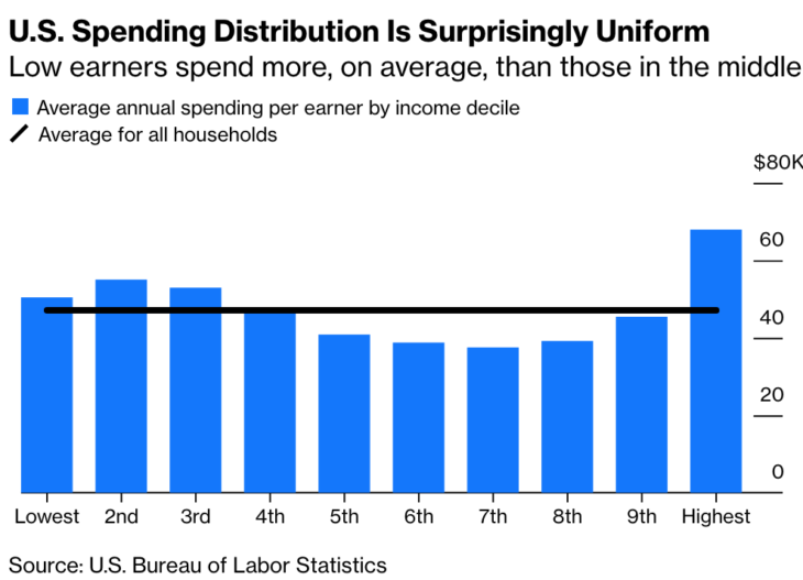
Bloomberg recently presented this graph, showing the average amount of consumption by people in each income decile:
I do not know if this graph is accurate—it seems implausibly flat to me. However, for the sake of argument let’s assume it is accurate. Even in that case it would present a highly misleading picture of consumption inequality, for exactly the same reason that income inequality is a misleading concept. Here’s Bloomberg:
One kind of inequality that’s invisible in the spending chart is inequality within each income decile. The numbers shown are averages, and within each decile are households spending more and less. This form of inequality doesn’t separate high from low earners or people with more wealth from those with less. Instead, it distinguishes high-spending households in all income deciles from low-spending households in all income deciles.
In the lowest-income decile, for example, are students with little or no income, who nevertheless spend a lot supported by parents, student loans and prior years’ savings. This pulls up the spending average, disguising the troubles of a minimum-wage, part-time, no-benefits worker trying to support a family.
If you are a progressive then you are probably skeptical of this graph, and rightfully so. It’s good to be skeptical, but also important to understand why the graph is misleading. It is misleading because income is not a good measure of economic well being.
READER COMMENTS
Josh
Dec 1 2019 at 8:28am
Someone must have the raw data that generated that graph. Why can’t we ever just get a scatter plot of stuff like this? Why the need to aggregate a zillion individual data points into 10 means (which then requires a bunch of caveats about why the aggregated figure is misleading)?
Rob Rawlings
Dec 1 2019 at 9:55am
If I understand the chart correctly then I do not think it shows what the Bloomberg article claims that ‘Low earners spend more, on average, than those in the middle’
It shows ‘Average annual spending per earner by income decile’. Lets say average spending per household is $40,000. Lets say there are 100 low and 100 high spending households. The low spenders spend $20000 per household and have 50 earners, giving $40,000 for the chart. The high spenders spend $80,000 per household but have 200 earners so give the same $40,000
You get a flat chart like the one shown but there is still significant income differences.
Rob Rawlings
Dec 1 2019 at 11:29am
‘there is still significant income differences’ should be ‘there is still significant spending differences’
nobody.really
Dec 1 2019 at 12:57pm
The article hints at an anomaly in the lowest decile. I surmise that they calculate the amount of spending per HOUSEHOLD in the decile, and divide by the number of EARNERS per decile. Because many households in the lowest decile have no earners, living entirely on transfers, you get some odd results.
I also surmise that “consumption” includes medical spending. I could imagine that lots of medical spending might correlate with impaired earning capacity, and thus lots of government transfers. And that’s what I’d want to see.
Robert Schadler
Dec 1 2019 at 1:26pm
Concerns about “inequality” is everywhere. For examples, it is almost impossible to read a newspaper without, somewhere, a discussion of some kind of “inequality, and, likewise, listen to any Democratic candidate for president without hearing a complaint about “economic inequality.”
Has there been a worthwhile discussion of what either “income equality” or “wealth equality” would look like in the real world?
Should “income equality” be determined by income earners or household? By education or skills? By experience overall or seniority at a specific workplace? By part-time workers or those who choose to work extra hours? Would older workers earn the same as newcomers to the workplace? Workers in New York city and rural South Dakota? Those who save rigorously for decades (and thereby have income from dividends and capital gains) and those who do not? What about those who, via inventions or remarkable management skills, add unusual value compared to those who do not?
Similar issues affect the notion of “wealth equality.”
If “income equality” seems beyond any common understanding, why should “income inequality” be such a wide-ranging concern?
Utterly different, but often conflated, are discussions of how low-earners might improve their ability to earn more. That is, in part, a genuine economic issue about which an intelligent discussion can be constructive.
Gordon
Dec 1 2019 at 6:04pm
The Bloomberg graph cites the BLS as the source of its data but the graph seems very much at odds with the table there that breaks down household expenditures by income quintile.
https://www.bls.gov/cex/2018/aggregate/quintile.pdf
According to the BLS table, the top quintile accounted for 38.9% of total consumer expenditures in 2018 while the bottom quintile accounted for 8.9% of total consumer expenditures.
nobody.really
Dec 2 2019 at 1:53pm
The BLS table analyzes things in terms of “consumer units,” which I take to mean something like households. So households are first ranked according to their income, then divided into quintiles, and then the BLS calculates the consumption in each quintile. But the graph also denotes number of earners in each household–and households in the lowest quintile have an average of 0.5 earners. Roughly, only half the households have even one earner. In contrast, households in the topmost quintile have 2.1 earners.
In contrast, I understand the Bloomberg graph to rank households according to income, divide them into deciles, and then report consumption DIVIDED BY EARNER for each decile. Where there are few earners (as in the lowest decise), consumption will seem unexpectedly high; where there are many earners (as in the highest decile), consumption will seem unexpectedly low.
This prompts the question, why should we care about rate of consumption PER EARNER, rather that PER CAPITA? Do they imagine that people who don’t earn don’t eat? In short, I don’t understand the rationale underlying the design of the Bloomberg graph; it appears to be “cooked” to produce a false conclusion about equality.
Gordon
Dec 2 2019 at 2:16pm
Thanks for the clarification on how Bloomberg arrived at their graph. Sometimes when I see very questionable quantitative analyses I’m left wondering if there was an intent to deceive or it was the result of incompetence. In this case I agree with you that it seems like a desire to cook up a particular result.
François Godard
Dec 2 2019 at 6:14am
Are mortgage payments part of “spending”? Of course owner occupied homes without a mortgage enjoy a much higher standard of living at the same spending level.
Floccina
Dec 2 2019 at 3:10pm
I would think that you want to include depreciation and interest above inflation but I bet they did not do that.
mbka
Dec 4 2019 at 8:23pm
Scott,
even more rarely discussed or acknowledged: Why is inequality considered a negative rather than a positive (diversity! yay!) or a neutral (e.g., as a natural consequence of human diversity, but otherwise unimportant as a metric).
I see a case for considering poverty or misery a negative, but not, inequality per se.
In any case – one can either have equality in treating people (rules to live by), then we’ll get inequality of outcomes due to diveristy of human abilities and choices made. Or we obsess about inequality of outcomes, then we’ll necessarily need to have inequality in treating people. Hayek wrote about that extensively.
Comments are closed.