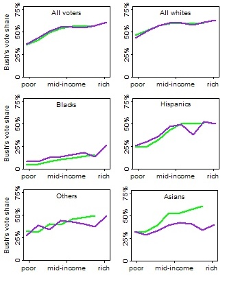
Andrew Gelman, King of Charts and Graphs, and author of Red State, Blue State, Rich State, Poor State, has prepared an exclusive set of statistical pictures just for Econlog readers.
Gelman’s graph shows CNN’s exit poll data, broken down by income and ethnicity. The green line is 2000; the purple line is 2004.

If you want more details about these graphs, his 2004 graphs exactly parallels the one I showed in my last post, but the 2000 graphs lump everyone making over $100k into one income category.
Random observation: The Hispanic voting data seem to support my pet theory that the smart long-run strategy for Republicans is to embrace Latin American immigration. Mid-income Hispanics already vote Republican. If you’re willing to generalize from cross-section to time series, it’s quite plausible that economic growth will gradually Republicanize Hispanics – unless anti-foreign populism gets in the way. As I suspect it will.
READER COMMENTS
Steve Sailer
Aug 5 2008 at 10:00pm
But you are assuming that Hispanics move up the ladder the more generations they stay in America. Unfortunately, that doesn’t appear to be true. The new “Generations of Exclusion” study by the UCLA Chicano Studies Department found that only 6% of 4th generation Mexican Americans were college graduates. It also found that between 1965 and 2000, Mexican-Americans born in LA had their incomes held down sharply by massive immigration from Mexico, while Mexican Americans in San Antonio, where there was little immigration over that 35 year period had done much better relatively than those in LA.
Brad Hutchings
Aug 5 2008 at 11:50pm
I love the little, presumably nouveau riche guilt bump at the right. If it were instead an IQ distribution, I would call it the 110 IQ crowd who think they can run everything by planning.
Pedant
Aug 6 2008 at 1:09am
The Inductivist disagrees:
http://inductivist.blogspot.com/2008/01/do-immigrant-groups-move-right-as-their.html
http://inductivist.blogspot.com/2008/01/which-immigrant-groups-become-more.html
8
Aug 6 2008 at 9:23am
Is the lack of a middle-income to rich decline in Bush support in 2004 due to the fact that he didn’t run on tax cuts, or tax cuts became less of an issue than Iraq or other issues?
floccina
Aug 6 2008 at 9:42am
A larger percent of the richer hispanics are Cubans so the question is do Mexicans vote Republican as the make more money.
sourcreamus
Aug 6 2008 at 1:53pm
What did Bush do during his first term that pissed off the Asians?
Anonymous
Aug 6 2008 at 6:15pm
Yeah, what’s the deal with the Asians? Why the drop in Bush support? “Axis of Evil” rhetoric?
Comments are closed.