Categories:
Cost-benefit Analysis
Economic History
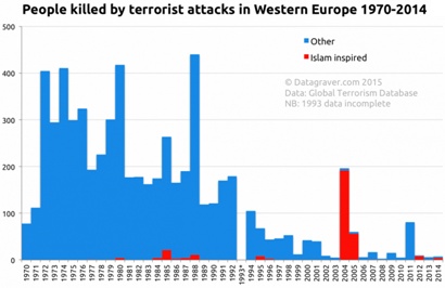
Is there anything seriously wrong or deeply misleading in either of these graphs?
From Datagraver:
From Statista:
READER COMMENTS
Chris Thomas
Apr 1 2016 at 12:21am
The way the first graph distinguishes between types of terrorism might be misleading. It makes Islam look like a relatively small inspiration, but the comparison sample is just “other”. If they broke it down more, would Islam look represent a plurality of terrorist inspirations, a small minority, or a roughly equal inspiration to other causes? The graph does not let us know, but it makes Islam look like a small cause.
*btw, I don’t know, and don’t have an opinion about what a more broken down version of this graph would show. I’m just pointing out a way it could be misleading.
Nathan
Apr 1 2016 at 12:31am
AFAIK, the only potentially misleading element is the region and time period chosen. Clearly the dominant contribution there comes from Northern Ireland, which as you might recall was a pretty big deal at the time. Restricting it to western europe omits things like Chechnya or September 11 or any of the four recent attacks in Turkey. And of course if you expanded further to include Asian countries the numbers would be dramatic.
Ultimately, whether this is a misleading graph depends on what question is being asked. If the question is “Is Islamic terrorism currently a worse problem for western Europe than the IRA was?” then I would say it is not. If the question is “Is Islamic terrorism currently a significant problem for the world?”, I would suggest it is.
MikeP
Apr 1 2016 at 12:36am
Is there anything seriously wrong or deeply misleading in either of these graphs?
Only that the people having cows about terrorist attacks or security or Islamic migrants or the like are completely immune to data.
Daniel
Apr 1 2016 at 12:52am
Yes, there is something materially wrong with the first graph. Firstly, it lists attacks committed by muslim terrorists, inspired by islam as being “other”, so long as they did not have some other motive beyond just islam (ie Palestinian terrorism). Secondly, it is misleading to show islamic terrorism vs all other forms of terrorism, rather than each specific subset of terrorism/terrorists.
It is important to note that while terrorism levels might be reduced, the problem of terrorism has actually increased. Terrorism isn’t about killing people, it’s about spreading fear. Information is shared to a much greater extent today. People’s knowledge of a terrorist attack is going to be much greater today than it was 40 years ago. This means that per terrorist attack, more fear is created.
Brian
Apr 1 2016 at 1:55am
The two graphs are mostly lies and propaganda.
1. The big numbers from the 1970s and 1980s are not terrorist events in the modern sense. Spain’s ongoing but incomplete conquest of the Euskadi and England’s ongoing conquest and suppression of Northern Ireland were continuing. The locals were fighting back against the colonial powers.
Those two conflicts were resolved after centuries in the 1990s because Europe was finally rich enough and professionally governed enough to buy off the losers. That is a great achievement but it does not retroactively make the resistance freedom fighters into terrorists.
2. The first graph classifies Lockerbie and Munich as non-Moslem inspired. Perhaps this is just a mistake but it looks like purposeful deception.
3. The definition of Europe is constantly changing. The terror campaign against dissidents in eastern Germany is not included at all, but the same territory is included later.
4. There’s no mark to normalize against some standard. An idea of how many people are dying from car crashes or shark attacks would help give a sense of scale.
5. The graph excludes small scale hate crimes aimed at intimidation and suppression that are driven but not explicitly organized by terrorist ideological communities, such as the Drummer Lee Rigby killing. Meanwhile ordinary looney mass murders like Brevik are included as if they were organized terrorists. The selection is apparently done to promote an anti-Europe, pro-terror ideological agenda.
That’s just what I could see without any access to original data or familiarity with current European conditions.
The rule here is that once someone is willing to purposefully lie to you to persuade you of something, you can’t then trust anything else he tells you about the subject. The graphs are completely worthless agenda-driven falsified propaganda.
Yaakov
Apr 1 2016 at 2:18am
1) Pan Am Flight 103 is not classified as Islam inspired. If it was not Islam inspired then the term is meaningless. It should be “carried out by Islamic people.”
2) The blue and yellow colors dominating the second graph tell the main story. They cover the Troubles and the Baskian movement attacks. Both were geographically contained in a single country. As can be seen in the second graph, both are over. I think economists call this “time preference” or something of the sort.
So mainly the question is, what are these graphs supposed to prove? Maybe a world wide view including Algeria (over 100,000 victims), Syria, Lebanon and Iraq, would give a better picture.
Matthew Moore
Apr 1 2016 at 4:09am
Lockerbie is contentious. Certainly, as a Briton I have always viewed Gaadafi as an Islamist ruler.
I’m not sure what the graphs are meant to prove? That Islamic terror is not yet as effective as Irish terror? And that therefore current fear is misplaced?
There are a number of key differences:
1. The IRA tended to select targets that it felt were part of the occupying forces – soldiers, policemen, politicians etc.
2. Where civilians were at risk, they would usually give a warning in advance of detonation
3. The IRA had narrowly defined political goals (a politically united Ireland), whereas Islamist terror ambitiously aims for the overthrow of Western civilisation.
4. The IRA were very careful to avoid targeting children
5. The IRA attempted only limited mainland bombkng, with the vast majority of deaths occuring in Northern Ireland
In short, although a random Brtion is less likely to die from terror today than in the seventies, the ‘average’ Briton is more likely to. Islamic terror is scary not because of its body count, but because of its randomness and nihilism.
Matthew Moore
Apr 1 2016 at 4:14am
Also, the graph is misleading because it excludes the 2015 Paris attacks, which might make red 2000 look more like blue 1970
Also, as above, Munich should be red.
Michael Savage
Apr 1 2016 at 4:50am
I say no. Big truth is that fewer people are being killed in terrorist attacks, although there have been more really big incidents recently. Graphs capture that story in a way that popular reporting misses. I see the criticism above as quibbles, in that context. You could argue that Northern Ireland was more like an anti-colonial war, but fact remains that chances of being killed by violent, organised, non-state political actors is much lower than it used to be.
Mikk Salu
Apr 1 2016 at 5:46am
Probability to be killed or injured by terrorists is very small. It is very small today, it was very small in 1970s. In this sense these two graphs are meaningless.
But if the goal of these two graphs to say that islamic terrorism is no big deal, then I would agree what Brian said.
Basque country and Nortern-Ireland were isolated events, local, with specific goals without universal ambitions. They did not challenge western values, societal norms and rules. But islamic terrorism does. For instance, after Jyllands-Posten and Charlie Hebdo, freedom of expression in Europe has de facto diminished. Not by law, but because of fear. Also it means that one religion has been able to achieve special treatment compared to other religions.
So , chance to be killed by terrorist is small and was small. But islamic terrosim is more dangerous because it attacks (and at least partly succesfully) values and societal norms what Basque and NE did not.
konshtok
Apr 1 2016 at 6:29am
a different interpretation
the graphs record the peak and fall of soviet backed terrorism (including IRA,ETA and PLO) but only shows the beginning of the islamic terrorism wave
Daniel
Apr 1 2016 at 7:04am
[Comment removed pending confirmation of email address. Email the webmaster@econlib.org to request restoring this comment. A valid email address is required to post comments on EconLog and EconTalk.–Econlib Ed.]
Stephan Okhuijsen
Apr 1 2016 at 7:36am
The first graph has an history. The first edition was posted as a reaction to a statement done by a politician in the Netherlands. He stated that in Europe less than 2% of attacks were done by islamic groups.
If you only count attacks, that was correct. But the impact of attacks is better measured in the number of casualties.
This was the result:
http://sargasso.nl/uitsplitsing-terrorisme-europa-2000-tot-en-met-2013/
(sorry in Dutch).
Later on this evolved in the graph shown above.
The most recent version of this graph can be found here:
http://www.datagraver.com/case/people-killed-by-terrorism-per-year-in-western-europe-1970-2015
(at the bottom)
The definition used for “islam inspired” is that the main purpose of the group should be either creating something like an islamic state or acting out of defending islam (attacking those who defy it) or attacking other people because they are not muslims.
The Lockerbie case does not fit this definition. Neither do the Palestinian cases.
And yes, the graph is misleading. All graphs that are based on selections are in some way misleading.
Overall terrorism in the world is up, even though in Western Europe it still seems low compared to the 70’s and 80’s.
http://www.datagraver.com/case/toenemend-terrorisme-wereldwijd
(sorry, Dutch again)
Capt. J Parker
Apr 1 2016 at 9:23am
@Brian,
You said:
I’m not sure that “freedom fighter” and “terrorist” are mutually exclusive terms. Even if one were to grant the the IRA had legitimate reasons to wage war against a foreign colonial power, certain acts by the IRA can still be classified as terrorism.
John Hall
Apr 1 2016 at 9:33am
Would be interesting if they labeled Marxist inspired as well.
Dustin
Apr 1 2016 at 9:48am
1) Western Europe isn’t representative of the entire world
2) The past isn’t a prologue
3) Instances of terrorism are highly volatile and inherently unpredictable
4) Terrorism can spread rapidly from current global hot zones
5) The west has a stated enemy who has declared an intention to increase such attacks
6) Threats =/= risk events, and these graphs don’t illustrate what is behind the curtain, so to say (many threats are mitigated by law enforcement / national intelligence prior to a risk event)
It’s like showing a graph of the 3 decades prior to the financial crisis – it makes for a nice history lesson that has zero relevance for the future.
It’s all good, until it’s not.
Glen Smith
Apr 1 2016 at 10:00am
Nothing misleading if you take time to realize that charts are designed to help the researcher form a proper hypothesis.
mico
Apr 1 2016 at 10:18am
Seems about accurate. The Troubles in the UK alone killed a few thousand people, which is a lot more than Muslims have killed subsequently, and the magnitude difference looks about right.
It may be misleading in that the Muslim population of Europe was much smaller in 1975 than it is today. If the implication is that one should average Muslim terrorism over the whole time period, it’s misleading. If the implication is that recent Muslim terrorism fueled by recent immigration has been much less severe than past nationalist terrorism, it is not.
But to my mind the most interesting feature of this graph is not to do with Muslims, but rather how the death rate due to nationalist terrorism collapses following the fall of the Soviet Union. Having lived through that time in the UK, my impression was that the IRA was pretty fearsome in the early 90s, maybe more so than it had been previously, and that the Good Friday Agreement was the real break. Looking at this graph, though, the IRA had already been operating at much reduced capacity for almost a decade at that point. That ETA did the same, at the same time, makes this a bit too much to be a coincidence.
Between the fall of the USSR and the introduction of a lot of Muslim immigrants, terrorism in Europe is clearly running on fumes.
Patrick R. Sullivan
Apr 1 2016 at 10:21am
Well, it doesn’t mention the KGB, and when it went out of business.
Patrick R. Sullivan
Apr 1 2016 at 10:28am
Exhibit A would be Vladimir Ilyich Sanchez Ramirez (AKA, Carlos the Jackal);
jim
Apr 1 2016 at 11:13am
I think they left out 9/11 and the 2,000-3,000 that died in that attack.
MikeDC
Apr 1 2016 at 11:54am
The truly misleading part of the graphs is that they’re basically the “seatbelts kill” argument applied to terrorism.
The data doesn’t tell us much of anything about the underlying response function a society might employ against terrorism. At the “don’t bother taking any precautions at all” extreme, we can expect lots of terrorism. At the “employ a complete totalitarian lockdown of society” we can expect no terrorism, but at an incredibly high cost.
In this sort of analysis there’s another big problem with the graphs, in that many of the “victims” of terrorism noted above (i.e. soldiers and police) were actually “resources” being employed to combat the terrorists political goals.
That is, they’re more properly considered a cost of preventing terrorist attacks than a cost of terrorist attacks. Which is a funny sounding distinction, but an important one.
Lincoln
Apr 1 2016 at 12:44pm
[Comment removed pending confirmation of email address. Email the webmaster@econlib.org to request restoring this comment. A valid email address is required to post comments on EconLog and EconTalk.–Econlib Ed.]
Jesse C
Apr 1 2016 at 1:02pm
I wonder what would be a good value of X here:
BC will bet $1000 even money that there will not be an Islam-inspired terrorist attack in Europe that kills X people before 2026.
Jon Murphy
Apr 1 2016 at 1:36pm
@jim: those attacks occurred in the US, not Western Europe.
MikeP
Apr 1 2016 at 1:41pm
The truly misleading part of the graphs is that they’re basically the “seatbelts kill” argument applied to terrorism.
Interesting. To me the graphs are the “car accidents kill” argument applied to terrorism.
Overlay the death rate from automobiles on this graph and you’ll see how minor the problem of terrorism is — the graphs showing that it’s even more minor today than yesterday. Yet we cope with the risk of car accidents all the time, suffering only minor inconveniences such as seatbelts, a couple thousand dollars per car in mandated safety, and harsher traffic laws that decrease that risk by perhaps half. The reaction to terrorism is not only an order of magnitude more disruptive: disruption is exactly the reaction the terrorists are looking for!
Look at 9/11. $25 billion of physical capital lost. About the same in human capital. Trillions of dollars lost in the reaction, and an outcome in the Middle East that is more conducive to exported terrorism, not less.
It was indeed sad that news media thought they had to move their anchors to Paris after the attacks there. We should all treat terrorism on the ground as a crime perpetrated by asses, not as a change in the way we have to live.
Shane L
Apr 1 2016 at 3:54pm
“The locals were fighting back against the colonial powers.”
This is a very poor description of events in Northern Ireland where the majority of people supported and continue to support its presence within the United Kingdom. The Protestant, mostly pro-British, majority community in Northern Ireland dates back to the 17th century, around the same time as the English presence in the United States. They are no more an occupying colonial power than Euro-Americans are an occupying colonial power in the Americas.
The popularity of Irish nationalist terrorism derived from the general discrimination experienced by the Catholic community in Northern Ireland in the 1960s. When their attempts to protest for civil rights – inspired in part by black American protests of the same era – were met with police brutality, the radical narrative of the various IRA groups gained support.
Some commentators here are underestimating the often barbaric nature of the Irish and also British Unionist terrorist campaigns. No, they did not diligently strike only police and soldiers. Some examples:
– 1974: UVF murder 33 civilians in twin bomb attacks at pubs in the Republic of Ireland.
https://en.wikipedia.org/wiki/Dublin_and_Monaghan_bombings
-1987: Provisional IRA murder ten civilians (many old age pensioners) and one police officer attending a war memorial service at Enniskillen.
https://en.wikipedia.org/wiki/Remembrance_Day_bombing
– 1974: suspected Provisional IRA bombing kill 21 civilians in pubs in Birmingham, UK.
https://en.wikipedia.org/wiki/Birmingham_pub_bombings
– 1998: Real IRA murder 31 civilians with car bomb in Omagh.
https://en.wikipedia.org/wiki/Omagh_bombing
– 1972: British soldiers shoot dead 26 unarmed civilians at Catholic civil rights march.
https://en.wikipedia.org/wiki/Bloody_Sunday_%281972%29
– 1987: INLA abduct an Irish dentist and chop off his little fingers with a hammer and chisel, threatening to dismember him up unless they received ransom.
https://en.wikipedia.org/wiki/Dessie_O'Hare
– 1971: UVF bomb Catholic/Nationalist McGurk’s Bar, murdering 15 civilians including two children.
https://en.wikipedia.org/wiki/McGurk's_Bar_bombing
– 1972: Official IRA murder 7 civilian workers including an “elderly gardener” and a Catholic chaplain with a bomb that was intended for the British Army.
https://en.wikipedia.org/wiki/1972_Aldershot_bombing
– 1978: Provisional IRA murder 12 civilians with firebomb of restaurant.
https://en.wikipedia.org/wiki/La_Mon_restaurant_bombing
– 1983: Provisional IRA bomb kills three police and three civilians outside department store in London.
https://en.wikipedia.org/wiki/Harrods_bombings
These are just a few examples. Of an overall 3,532 violent deaths, 1,785 were civilians. It was a bloody and nasty conflict that featured repeated attempts to murder and terrorise civilians from rival communities.
http://www.cain.ulst.ac.uk/sutton/tables/Status.html
Andrew M
Apr 1 2016 at 5:21pm
1. From 2001 onwards, preventative action against terrorism massively increased in Western Europe. So at best the graphs post 2001 tell you the probability of terrorism given a certain level of enhanced preventative action and vigilance. They don’t tell you the probability of terrorism if current precautions were to be abandoned–just as the statistical infrequency of deaths by lightning strikes doesn’t mean it’s safe to wander around in open fields during electric storms.
2. Prior to 9/11, even the nastiest terror groups in Western Europe sought the deaths of at most dozens in a single attack. 9/11 showed that there are terrorists who seek the deaths of thousands. And terrorists who seek the deaths of thousands would probably feel no compunction about going much further: they just don’t care about the lives of people unlike themselves. So the worst case scenario for terrorism is a great deal worse now than it was before 9/11, and that should enter into a rational calculation of our response to terrorism. The graphs fail to show this.
Bonus: Though the absolute chance of dying in a terrorist attack in Northern Ireland during the so called “Troubles” was small, it was high enough to make living there at that time pretty miserable. Contrary to what is sometimes assumed, terrorism doesn’t have to achieve anything close to the death rate of auto accidents to fundamentally transform our lives. That this is so may well reflect the irrationality of the masses, but that irrationality (if that’s what it is) isn’t going away any time soon. We have to reckon with it in determining anti-terrorism policy.
Weir
Apr 1 2016 at 8:21pm
Suppose you were in a conversation about the civil rights movement and Jim Crow and someone mentions the bombing of the Baptist church in Birmingham in 1963. This one guy says to you, “There were only four deaths. Just four girls. That’s all.”
He says that the danger posed by white supremacists was minimal. He points out that the Klan was losing influence within the Democratic Party. He says Martin Luther King was obviously exaggerating when he called the bombing “one of the most vicious and tragic crimes ever perpetrated against humanity.”
The next thing he says is that white supremacists were “actually far less ambitious” than their equivalent today. At which point you can simply point out that car accidents have killed far more people than white supremacists and Islamic supremacists combined, because you missed the point entirely.
MikeP
Apr 1 2016 at 10:05pm
I would think I was conversing with a certified idiot. Martin Luther King was not exaggerating when he called the bombing “one of the most vicious and tragic crimes ever perpetrated against humanity.”
Nonetheless, however barbaric the killings during the Civil Rights movement were, I would still hope that society did not overreact and dramatically remake itself in response to a bunch of asses who killed a few people a year for a couple decades — and not particularly conspiratorially at that.
What’s the alternative? Metal detectors and bomb-sniffing dogs at every church? Prohibiting the free movement of white people?
Hans
Apr 2 2016 at 9:18am
Brian, you nailed it good.
Also, this is a product from the University of MerryLand or perhaps it was posted on April Fool’s Day for good reasons.
Alan Crowe
Apr 2 2016 at 1:38pm
Back in the 1970’s and 1980’s there was a wave of new religious movements (also known as cults). The Moonies, Scientology, Hare Krishna, Bhagwan Shree Rajneesh, to name four.
I went off to University in 1978. Parents then didn’t just worry about drugs and sex, they worried that their 18 year old “children” would drop-out and join a cult. Now-a-days they might worry that their “child” is going to get mixed up in Islam and become radicalized and move on to fire-and-sword Islam.
You could make a case that fire-and-sword Islam is super-retro revivalism, and not new. I don’t accept that. Picking the date of the Golden Age that you pine for is something that each generation does for itself, in reaction to their own time. They chose anew.
I see fire-and-sword Islam as a new religious movement or cult. The graph should be comparing the terrorism it inspires with that perpetrated by other cults, Moonies, Mormons, etc. You can make quite a good case that Marxism is a cult and belongs on the same graph.
The IRA and Basque separatists are at the nasty end of guerrilla war. They belong on a different (and much bloodier graph) along with civil wars, wars between states, and revolutions.
Weir
Apr 2 2016 at 9:04pm
There’s a pattern here. On Thursday the White House first uploads a video to YouTube in which the French President says of himself and his counterparts that they are
But soon the White House takes the video down, replaces the audio for that brief comment with silence, and uploads their new, censored video instead. That’s one example of what we keep seeing from people whose strongest objection is not to the beheadings and the bombings but to people saying out loud that terrorism is vicious and tragic, without then saying that car accidents are a much greater danger, or that climate change is a much more urgent threat, or that the only correct reaction is to talk about something else.
Miguel Madeira
Apr 2 2016 at 10:05pm
Brian: “2. The first graph classifies Lockerbie and Munich as non-Moslem inspired”
Matthew Moore: “Also, as above, Munich should be red.”
The leader of the Palestinian terrorists of Munich was a Christian, using “Issa” (“Jesus”) as war name; the code name of the attack was “Operation Iqrit and Biram” (two Arab Christian villages destroyed in 1948). Some people seems to forget that the Palestian terrorism in the 1970s was disproportionally Christian (or at least from Communists born in Christian families).
Comments are closed.