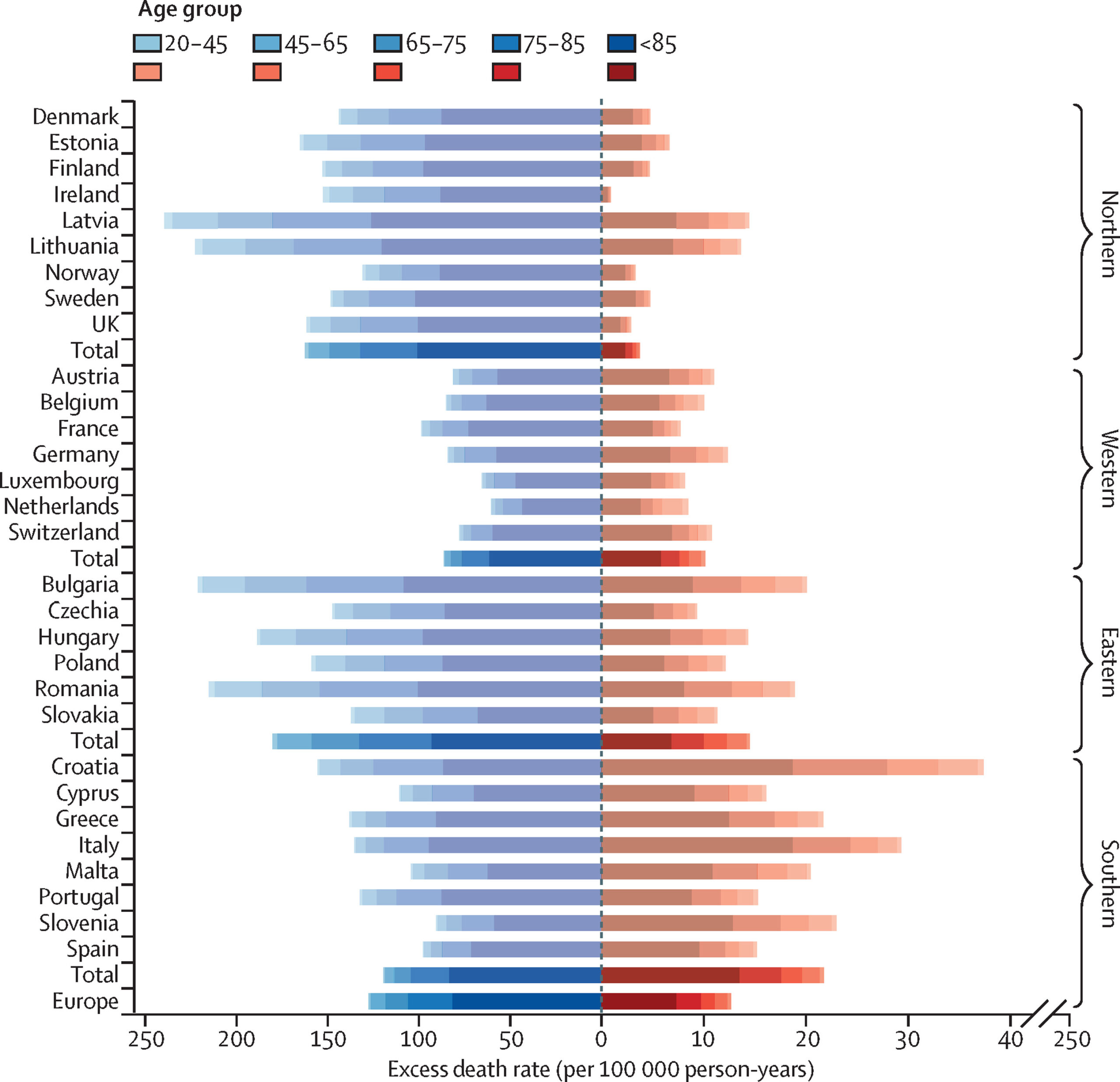

A whole lot of authors wrote a recent piece in Lancet, the well-known British medical journal, on deaths from cold and deaths from heat. The above is one of the key graphs they present. Deaths from heat are in red; deaths from cold are in blue.
Quick question: What is the approximate ratio of deaths from cold to deaths from heat?
I highly recommend that you answer before reading on.
I knew that the ratio was very high because I’ve studied the data in the past. And indeed, in their findings up front, the authors write:
Across the 854 urban areas in Europe, we estimated an annual excess of 203 620 (empirical 95% CI 180 882–224 613) deaths attributed to cold and 20 173 (17 261–22 934) attributed to heat. These corresponded to age-standardised rates of 129 (empirical 95% CI 114–142) and 13 (11–14) deaths per 100 000 person-years. Results differed across Europe and age groups, with the highest effects in eastern European cities for both cold and heat.
But many people are “visual.” They will look at a graph and not look carefully. If they see that line A is way bigger than line B, they will assume that the magnitude of A exceeds the magnitude of B by a large margin.
In the graph above, you will see, if you look carefully at the axes, that this is not what’s happening. The distance that measures 10 for deaths from heat measures 50 for deaths from cold.
HT2 Daniel Klein, who sent this link.
Update: As the first 3 commenters pointed out below, I misstated the question. It is now fixed.
READER COMMENTS
Arthur
Aug 1 2023 at 9:28am
I don’t understand. Both the graph and the excerpt claim there are “more deaths from cold than from heat.” In the case of the except, 200k deaths from cold, 20k from heat. The chart distorts the magnitude, but the line for cold is longer. What am I missing?
Daniel
Aug 1 2023 at 9:45am
I had exactly the same thoughts and question.
Pete Smoot
Aug 2 2023 at 1:01pm
Right, and that’s the issue. It distorts the magnitude by a lot.
And with just a little tweaking, you could easily mislead people into thinking there are a lot more deaths by heat than cold.
I always look at the axes because I frequently find charts misleading. Not using logarithmic axes for exponential curves, not using or showing where zero is, those are typical.
Using different scales for two disjoint parts of the same chart, that really seems like they’re trying to mislead us. I don’t see how you do that by accident.
Dylan
Aug 1 2023 at 9:48am
I think you didn’t say what you meant to say here.
And, agreeing with Arthur, if I just look at the graph without checking the x-axis labels, it looks like there are a lot more deaths from cold than from heat. Once I read the labels, I see that it’s an order of magnitude more.
Of course, this is just looking at Europe, which is not that hot of a place overall. I imagine there are far less deaths from cold in Africa.
David Henderson
Aug 1 2023 at 9:57am
To Arthur, Daniel, and Dylan: Thanks for the catch. I’ve corrected it. I’m still adjusting after a long relatively relaxing vacation.
Arthur
Aug 1 2023 at 10:22am
Good to know even homo economicus is still human. 🙂
David Henderson
Aug 1 2023 at 10:25am
LOL. Thanks.
Fazal Majid
Aug 1 2023 at 1:52pm
And this is why the works of Edward Tufte should be mandatory reading for any course that requires or includes Statistics 101 at any point.
Charles Hooper
Aug 1 2023 at 2:22pm
When I first saw this graph, I fell prey to the axis “issue.”
I was visually comparing cold deaths and heat deaths across European countries and noting which countries had more of one or the other. But I also compared the magnitude of cold deaths to heat deaths. It never occurred to me to look at the axis. (It never occurred to me that there would be two axes.) As a result, I concluded that this study showed that cold deaths exceed heat deaths by about two to one.
Wrong. It’s ten to one.
If I were to have developed this graph, I would have used a consistent scale for deaths and then, if more detail on heat deaths was desired, added a second graph for heat deaths only.
Thomas L Hutcheson
Aug 1 2023 at 5:20pm
This seems to echo a “discussion” I’ve seen elsewhere.
Like the “issue” of whether Covid originates by a natural animal transmission or from a lab leak, I cannot understand why it’s something that needs discussing on the internet. I guess it arises from some pseudo moral panic over deaths from heat this summer which in turn someone must think is relevant for the issue of what to do about the costs of CO2 accumulation in the atmosphere. But to me it looks like shadow boxing.
David Henderson
Aug 1 2023 at 8:02pm
Good big-picture point.
My point is more modest: a graph should not mislead.
Jim Glass
Aug 1 2023 at 10:24pm
My point is more modest: a graph should not mislead.
Who does this chart mislead? Literally: who?
Lomborg is fine with this chart, and if anyone would be upset about “misleading” on this point it would be him.
The chart lines are this length so the readers of the Lancet piece — who know full well the cold-hot death ratio — can see within the lines the deaths by age group, which are shown by the different colored segments in the lines. Look at them. Guess what, if the “heat death” lines were as tiny as everyone here wishes, you couldn’t see that data.
The purpose of the chart was NOT to show the hot-cold death ratios. Take the chart away from its context, ignore why it is designed as it is, tell lay persons who haven’t read the Lancet piece that the purpose of the chart is to (mis)represent the hot-cold death ratio, and those will be the people being misled.
Jon Murphy
Aug 2 2023 at 5:36am
As the post discusses, visual and quick readers.
Joel Pollen
Aug 1 2023 at 8:08pm
Graphs are a lot like statistical tests. They really need to be pre-specified. It’s hard to imagine the authors of this paper chose those axis magnitudes before looking at the data. It’s just as misleading as deciding which statistical test to use after you’ve had a chance to run the numbers a few times.
Vivian Darkbloom
Aug 1 2023 at 9:05pm
Perhaps this is a good example of the expression “off the charts”, as in “the number of deaths due to cold weather is off the charts”.
Jim Glass
Aug 1 2023 at 9:54pm
Bjørn Lomborg discusses the issue in some detail:
https://www.youtube.com/watch?v=nwOYjC2IzZc
He’s fine with the Lancet, citing another Lancet study which reports more cold than heat deaths also in Africa and Asia – in fact, much more so than in Europe and North America.
Charles Hooper
Aug 2 2023 at 12:50am
Bjørn is also the one who created the graph with the same scale on the left and right. So he’s critical of the Lancet in that respect.
Econ Ed
Aug 2 2023 at 9:40am
Why use two axes? Measure deaths from left to right on one axis. Measure deaths from cold with a blue bar and then stack a red bar on the right of the blue bar to measure the deaths from heat. The combined length of the red and blue bars shows the total number of deaths and the relative lengths of red and blue bars allow the reader to easily SEE that the red bars are much shorter than the blue bars.
[Note: This commenter, Econ Ed, is not the same person as the Econlib Editor. –Econlib Ed.]
steve
Aug 2 2023 at 6:32pm
I like graphs. They are a quick visual way to see things but you should always have access to the raw numbers. This graph is clearly misleading. They give you the raw numbers so if you really read the paper you are OK but it would have been more accurately informative to present it with a different graph. This is bad enough that it gives the impression of bad intent.
Steve
Comments are closed.