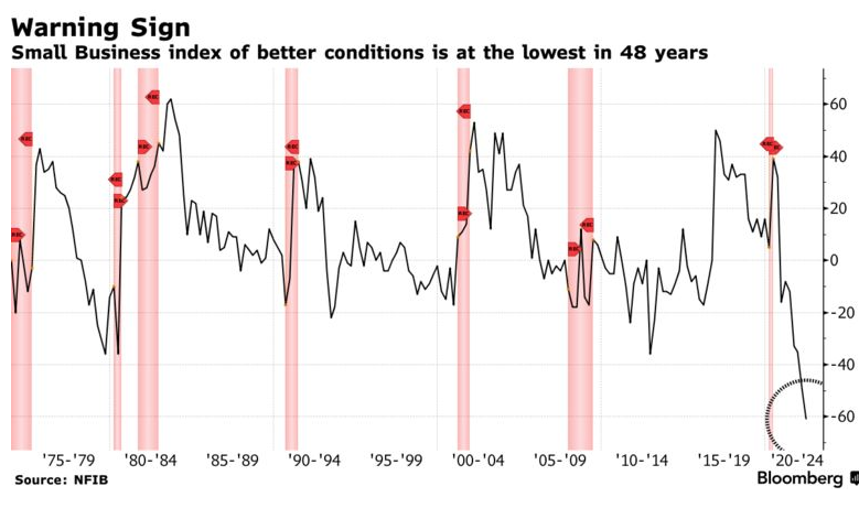
Bloomberg has an article discussing the prospects for the economy going forward. One pessimistic pundit cited this survey of small business sentiment:

At first glance, the recent drop looks worrisome. But then I looked at the entire graph. What do you notice? There seems to be almost no relationship between small business sentiment and the state of the economy. The two really big recessions (1981-82 and 2008-09) are hardly even noticeable. I can’t ever recall seeing a worse forecasting tool.
There are four odd surges in positive sentiment: late 1980, early 1991, late 2000 and late 2016. Why would small business people suddenly become optimistic about the economy? After all, the economy got worse in 1981 and 1982, and 1991 was a very mediocre year. It also got worse in 2001. It did get better in 2017, but nothing out of the ordinary. So why those four surges in positive sentiment? (Hint, what was going on politically at those 4 points in time?)
To be sure, there are some very good reasons to be concerned about the future prospects of the economy, including high inflation, an inverted yield curve and falling stock prices. I’m certainly worried. But don’t be swayed by pundits displaying graphs and telling you what it all means. Don’t be like a child hypnotized by a shiny object swaying in front of their eyes. Don’t become a victim of conformation bias. Look closely at the entire graph—does it make sense?
READER COMMENTS
Spencer Bradley Hall
Aug 10 2022 at 10:28am
Small business sentiment is ominous this time. The Elliott Wave Theory predicted it.
The economy is being run in reverse. “Capital expenditures, their level and mix, and applied innovation statistically prove to be the most important determinants of labor productivity growth.” Alan Greenspan’s: The Map and the Territory
All debt incurred which reduces unit costs of production and promotes productivity is obviously quite often “good” debt, regardless of how it is financed, with new money or existing savings.
See: Disintermediation: An Old Disorder With A New RemedyR. ALTON GILBERT and JEAN M. LOVAT
Disintermediation: An Old Disorder With A New Remedy (stlouisfed.org)
Sometimes it’s what you don’t see: “In the past, when market interest rates have risen above legal ceiling rates on time and savings deposits by similar margins (for banks and nonbanks), the growth of these deposits has slowed sharply. This is called disintermediation.”
Disintermediation for the DFIs can only exist in a situation in which there is both a massive loss of faith in the credit of the banks and an inability on the part of the Federal Reserve to prevent bank credit contraction, as a consequence of its depositor’s withdrawals. “Disintermediation is Made in Washington”.
In contrast to the thrifts, Reserve bank credit and thus total bank deposits never contracted.
Michael Rulle
Aug 10 2022 at 11:16am
@Spencer
Elliott Wave “Theory”? Really? You cannot possibly believe that—-maybe I am misreading you.
@ Scott
I am likely missing something in today’s market move. I believe the market is rational relative to expectations—so I am trying to figure out todays move. The last 7 months are annualizing at about 6.2% inflation. Which is terrible.
Therefore, perhaps, this months zero percent month over month was likely a big surprise. But the Fed targets PCE ex-food and energy. CPI ex food and energy month over month was .3 % (3.6% annualized—-) PCE comes out next.
Maybe the month beating the NY Fed’s “poll” release on Monday for consumer expectations could have something to do with it.
I cannot believe the 8.5 versus 8.7 was the reason (although often the real expectation is much different than the printed one)
What do you think?
Scott Sumner
Aug 10 2022 at 1:36pm
Stocks rose because inflation was less than expected. That’s makes a recession slightly less likely.
Michael Rulle
Aug 11 2022 at 6:53am
Believe it or not I knew that. I thought you might have had a view on that view—-but you too believe in rational expectations. I have discovered, speaking for myself, how convenient a belief that is———yet I still believe it.
Michael Rulle
Aug 10 2022 at 11:34am
PS. I assume there is an expectation that the Fed will be less “hawkish” as a function of these numbers——but it’s the same question as above —-why should the Fed be less hawkish?
As it relates to my personal semi-heuristic opinion—-I have been leaning bullish (I.e. less recession than expected, less need for increased tightening than expected, more likely return to normal growth than expected ——despite our government’s amazing ability to waste money.)
Spencer Bradley Hall
Aug 10 2022 at 3:35pm
The Elliott Wave Theory works well in retrospect. Not so much in prognostication. But Robert Prechter got Black Monday exactly right. And Daneric got the 2021 top in the Wilshire 5000. Of course, you have to deal with “alternate counts”.
Daneric’s Elliott Waves – Elliott Wave Theory, Technical Analysis, and Social Mood Commentary (danericselliottwaves.org)
See Aug. 3rd.
“SPR will not be drained, but releases are finished on Oct 31. Replenishment begins in 2023.”
Michael Rulle
Aug 11 2022 at 6:55am
It is the alternate counts that matter—-but thanks for your response——just wondering how you thought about it.
Spencer Bradley Hall
Aug 10 2022 at 6:52pm
“the CPI shelter data – which is arguably the stickiest of all and is again delayed 4 to 7 months – will peak sometime in September or October.”
That matches long-term money flows. Maybe its back in sync.
David S
Aug 11 2022 at 3:22am
Nobody asks me to participate in these surveys, and if they did I would probably make up some crazy stuff just to mess with the pollsters. As a small business owner the longest timeline into the future that I can manage is ONE MONTH. Anything longer than that is an exercise in futility. Honestly, I can’t control what happens tomorrow—clients go crazy, God smites someone, cattle stampede through the Vatican, etc…
Michael Rulle
Aug 11 2022 at 6:58am
Each of our individual opinions go into the whole——so sometimes we cannot learn that much from ourselves—although I always try too. In any event, it’s not the opinion polls per se that matter—-although I think they matter a little bit——it’s the prices in markets which are the dominant “poll” —-and when they are sucker punched prices change.
vince
Aug 11 2022 at 4:02pm
Lots of false positives and negatives, but it looks like downward spikes around the start of every recession, and upward spikes coming out of them. In between are general downards trends. One exception to the general downard trend was around 2016, after Trump was elected.
The amount of the current drop, however, is unprecendented.
Comments are closed.