I just returned from vacation and have some catching up to do. In the meantime let me point to a post over at Coyote Blog that relates to my recent post on the US recovery. The post begins by pointing to a graph in a post from late 2013 by Kevin Drum:
Here’s how Drum interprets the graph:
The result was predictable: spending cuts and more spending cuts. First came budget deals in 2010 and 2011 that reduced the deficit by $760 billion. Then, in August 2011, Obama struck an agreement with Republicans to resolve the debt ceiling crisis, which produced about $1.1 trillion in spending cuts along with the promise of more from a congressional supercommittee. At the end of 2012, the fiscal-cliff showdown resulted in $850 billion in tax increases and spending cuts. Finally, in March, sequestration cuts (cued up when the supercommittee failed to produce a deal) kicked in, to the tune of another $1.2 trillion. Taken as a whole, these measures have cut the deficit by $3.9 trillion over the next 10 years. And that doesn’t even count the expiration of desperately needed stimulus measures like the payroll tax holiday and extended unemployment benefits.
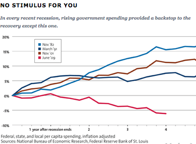
This was unprecedented, as the chart above shows. After every other recent recession, government spending has continued rising steadily throughout the recovery, providing a backstop that prevented the economy from sliding backward. It happened under Ronald Reagan after the recession of 1981, under George H.W. Bush after the recession of 1990, and under George W. Bush after the recession of 2001. But this time, even though the 2008 recession was deeper than any of those previous ones, it didn’t.
. . .
Along the way, there were plenty of Cassandras who warned that austerity was strangling the recovery in its cradle. They pointed to history: When FDR cut spending too soon in 1937, it famously throttled recovery from the Great Depression. They pointed to economic data: By 2010, we knew that the 2008 recession had been far worse than we thought during Obama’s first month in office, when the initial round of stimulus was passed. They pointed to Europe: Austerity there had crippled the recovery and kept unemployment at stratospheric levels in Greece, Portugal, Spain, and other countries. And they pointed to Ben Bernanke, the Republican-appointed Fed chairman (and Great Depression scholar) who all but begged Congress not to sabotage the recovery with foolish spending cuts.
Of course Drum is a Keynesian who doesn’t like austerity, and hence he attributes the slow recovery from the 2008-09 recession to fiscal austerity. One can find dozens of similar posts, written by other Keynesians. But Keynesians also tend to be Democrats, and they usually like Obama much more than Bush. Drum has a more recent post comparing the Obama and Bush recoveries. That post suggests that the recent recovery has actually been far more robust that the recovery from the 2001 recession:
Paul Krugman writes today about the dogged conservative claim that the current recovery has been weak thanks to the job-killing effects of Obamacare and Obama regulation and the generally dire effects of Obama’s hostility to the business sector. But I think Krugman undersells his case. He shows that the current recovery has created more private sector jobs than the 2001-2007 recovery, and that’s true. But in fairness to the Bush years, the labor force was smaller back then and Bush was working from a smaller base. So of course fewer jobs were created. What you really want to look at is jobs as a percent of the total labor force. And here’s what you get:
\
Of course I’m an opponent of fiscal stimulus, so you might expect me to claim this actually proves that austerity works, as the Obama recovery has less stimulus and more job growth. Or you might expect me to claim that Drum was being deceptive. But I don’t want to take the easy way out. Drum seems like a good guy and I don’t have any reason to believe he was intentionally deceptive. It’s natural for people to gravitate toward data that supports the argument they are trying to make on that particular day. I’m sure I do this as well, at least subconsciously. Nor do I think this proves austerity works. Indeed I have doubts about both graphs, as there are many ways of measuring the stance of fiscal policy, and there are many ways of measuring the strength of a recovery. It would be easy to find metrics (like RGDP growth) that make the Bush recovery look better. And I believe the fiscal policy was less austere than Keynesians claim, although I don’t doubt that in a relative sense 2013 was much less stimulative than 2010-12. (Of course growth sped up in 2013 (using Q4 to Q4 data.)
Instead I’d like to suggest these these two posts are a textbook example of why we all should be very skeptical of the information conveyed in graphs. There are many ways of framing data, and it’s relatively easy to find data points to support almost any particular point of view. There is something seductive about a graph, perhaps for the same reasons that a jury might find a photo more reliable than expert testimony.
You should be most skeptical of graphs provided by bloggers that you like. If you like my point of view, then be especially skeptical about my graphs.
HT: Warren Meyer
PS. It might be useful to think of Keynesianism as being like quantum mechanics. Just as the position of an electron is ambiguous until it is observed, the robustness of the recent recovery cannot be defined until one specifies the issue being examined. If it is GOP fiscal austerity, then the recovery was weak. If the issue is an appraisal of the Obama regulatory policies vs the Bush regulatory policies, then the recovery was robust.
READER COMMENTS
Chris Wegener
Jan 5 2015 at 11:39am
It would then seem interesting to me for you to show some graphs that would demonstrate that the Bush recovery was indeed better than the Obama recovery.
I would also like to see some data that would confirm your belief that fiscal stimulus doesn’t work. (That’s a throw away line because such evidence does not exist only the belief that it doesn’t. ;-))
Regards,
Chris
tom
Jan 5 2015 at 11:56am
You are clearly being generous in assuming this presentation has any honesty behind it.
Why measure everything from the start of the recovery? The Keynesian cry during the recession was “targeted, timely and temporary“. Every Keynesian model emphasizes the importance of importance of stimulus coming earlier (from the multiplier to combating animal spirits early intervention is definitively better in the Keynesian framework). There is nothing that implies the best time frame to discuss stimulus comes after the recovery has started, and plenty that suggests you want to look at spending on the eve of the recession.
The further you delve into the starting point of the graphs the worse it gets. If a government spent say 787 billion dollars on stimulus during a recession you would have a much higher base of government spending at the start of the recovery. A government that initiated a stimulus package of 5% of GDP during a recession and then held spending steady once the recovery took hold would look “austere” compared to a government that did nothing during a recession and then increased spending by 5% of GDP only after the recession through this lens. The reality is that (for example) with a 1 year recession after the bill had passed and 1 year into the recovery of flat spending the “austere” government would have spent twice as much from the baseline as the “stimulative” government (actually it is worse that this since the 2nd government would be “stimulating” from the absolute bottom of the recession and hence the lowest point of GDP and the total $$$ spent would be more than twice as much for the “austere” government).
It is obvious (already) that noting changes from the start of the recovery is the worst way to go- but it still gets worse! If spending FELL during the recession, and then bounced back to trend once the recovery started Drum would think that this is the most stimulus possible!
And it gets even more absurd than that. If a (hypothetical) government was budget constrained by revenue then expenditures would automatically fall during a recession and automatically bounce back during the recovery- cut the causation would run 180 degrees from the direction Drum wants us to believe.
tom
Jan 5 2015 at 12:07pm
@Chris,
You missed his point. here is the relevant quote from Drum
If the recovery is going well (ie better than the most recent recovery) WITH austerity that the previous recovery didn’t have- how can you conclude that austerity is bad?
Mark Bahner
Jan 5 2015 at 12:52pm
U.S. debt as a percentage of GDP:
Nov. 1982 = 35%
Mar. 1991 = 57%
Nov. 2001 = 56%
Jun. 2009 = 83%
Federal debt as a percentage of GDP
Looking at those values for government debt as a percentage of GDP, the figure labeled “No stimulus for you” actually looks completely appropriate.
It’s remarkable to me that anyone–but especially an economist–would think that the secret to success is spending money that a government doesn’t have.
Mark Bahner
Jan 5 2015 at 12:57pm
Oh…I see Kevin Drum is not an economist. His degree was in Journalism.
Shawn Smith
Jan 5 2015 at 1:30pm
I guess I’m a little confused…was the first article stating that the slow economy in 2009 and 2010 a result of austerity/sequestration done in 2010 and onward?
I think it is obvious that since the austerity/sequestration/spending restraint began in 2011, the economy has done much better than it did the 4 years prior when both administrations (Bush and Obama) passed stimulus packages.
Now, of course, this isn’t taking into account monetary stimulus via the Fed, but the Fed has kept interest rates low and have been purchasing securities for a long time now so there hasn’t been much change in Fed policy.
Brian Donohue
Jan 5 2015 at 2:09pm
Good post Scott.
Regarding the first graph and the much abused word ‘austerity’, I don’t believe we entered any of the previous recessions with a several-year track record of trillion dollar budget deficits. It was always gonna be ugly- I thought we all knew that.
As to the second graph, this is the third example in the past 30 years of effective and responsible government coinciding with economic growth due to POLITICAL GRIDLOCK. Of course, this argument gets no traction with partisans.
ThomasH
Jan 5 2015 at 2:14pm
Scott,
In what sense are you an opponent of “fiscal stimulus?” Is it not the case that low borrowing rates and lower opportunity costs for some inputs makes a recession (short term interest rates are near the ZLB because the economy is below it’s NGDP trend) the proper time to increase deficit financed investment? It seems odd that Congress would permit President Bush to carry out such projects but Congress would not allow President Obama to do so.
Scott Sumner
Jan 5 2015 at 2:51pm
Chris, You may recall that in early 2013 Paul Krugman said that 2013 would be a test of the fiscal stimulus hypothesis. He predicted that growth would slow. In fact, RGDP growth in 2013 was nearly twice as rapid as 2012. Perhaps you disagree with Krugman’s claim that 2013 was a test of the idea.
Mark Sadowski has done some empirical tests, and found that there is virtually no correlation between fiscal stimulus and growth, for countries with independent monetary policies. Other studies that have found an effect are totally reliant on countries without an independent monetary policy (and hence no monetary offset), mostly eurozone countries.
Tom and Mark, You raise some good points about measuring stimulus.
Tom, I try to be generous about the motives of those I disagree with. When I’ve read Kevin Drum in the past it seems like he is trying to be fair.
Shawn, You asked:
“I guess I’m a little confused…was the first article stating that the slow economy in 2009 and 2010 a result of austerity/sequestration done in 2010 and onward?”
That’s my reading–what do others think?
Brian, Good point.
ThomasH, A few points:
1. Not many shovel ready projects were ready, so it was mostly tax cuts, transfers, higher teacher salaries, etc.
2. In general, the private sector would do a better job in doing infrastructure. We should follow the Europeans and privatize airports, tollways, etc.
3. Yes, do projects that pass cost/benefit, but Keynesian fiscal stimulus theories predict that even those that don’t can be justified at the zero bound. That’s what I am referring to.
4. Low rates would also justify borrowing to create an American sovereign wealth fund–perhaps to reform social security down the road.
Daniel Kuehn
Jan 5 2015 at 3:28pm
The other problem with the second graph is that one of the big problems in this downturn has been labor force participation. If the labor force is your denominator that’s going to make things look rosier.
trent steele
Jan 5 2015 at 5:36pm
It’s almost as if “experts” (heck, even a journalism grad!) can say anything with graphs and numbers, and that they are just as “right” as they are “wrong.” In other words, the “economy” is not very complex and it is realistic to believe that experts can “run” it.
So by all means let’s target NGDP and print money, then calculate when we should pump money in, to whom, how much, etc! What could go wrong? I mean, it’s immoral, but at least it’s scientistic!
That is the Libertarian way!
Mark Bahner
Jan 5 2015 at 5:53pm
Hi,
Another thing to consider, beyond the fact that the federal debt was substantially higher at the end of this recession than in the previous three recessions to which Kevin Drum compares spending, is that the ratio of the federal deficits to the GDP coming out of this most recent recession were uniquely large.
The deficits in FY 2011, 2012, and 2013 were all above 8% of GDP. That’s much larger than any “peace time” deficits in the history of the U.S.:
History of U.S. deficits as a percentage of GNP/GDP
It seems very foolish to me to be advocating forcefully to do something that could easily end very badly, and is unprecedented in more than 200 years of history.
Brian Donohue
Jan 5 2015 at 6:41pm
Mark Bahner,
The word you are looking for, I think, is ‘austerity’.
I know, I didn’t believe it either, but economists seem pretty unanimous on this point.
JMK
Jan 5 2015 at 11:01pm
Since by definition G+C+I+NX=GDP, if a G declines as shown in the first graph, then GDP must also decline – holding the other variables constant
Of course, they are not constant so given a decline in G the other variables C+I+NX must increase by the decline in G, for GNP to remain at least flat.
Please explain how a decrease in G will cause a corresponding increase in C+I+NX.
Tracy W
Jan 6 2015 at 5:48am
JMK, you might find this article a good explanation of the theories of why this might happen, with some empirics involved. Or you might not. I’d be interested in your take on said article’s value as an explanation.
Shayne Cook
Jan 6 2015 at 9:09am
Dr. Sumner and several commenters here have noted that graphs can easily and “factually” be designed to convey whatever indication its designer desires.
Still other commenters (and readers) note that the grossly elevated levels of Federal borrowing during the period from 2009 on would argue against the voracity of Mr. Drum’s graph.
The fallacy lies in two aspects of Mr. Drum’s graph:
1.) Per JMK comment, GDP = G+C+I+NX. However, what is counted in those variables, and in the total (GDP), are only those expenditures for the purchase of newly produced goods and services. Government transfer payments are not included. And it was debt-supported Government transfer payments that were elevated during those years (and beyond).
2.) Mr. Drum also applies a “sleight of hand” in selecting the beginning year for his graph. The label for the X-axis is for “Years after the recession ends”.
The recession officially ended in 2009, a year that actually included slightly elevated Government spending on the purchase of newly produced goods and services, relative to both total (recession level) GDP, and previous AND subsequent years.
See http://www.bea.gov, Nominal GDP Data, table 1.1.5.
If you are wondering what happened to the elevated “transfer payments” that were distributed by Government during that period, you’ll find part of the answer in the GDP data – (C)onsumption spending (for newly produced goods and services) remained above the 70% level until 2013. (Again, in nominal terms, and as a percentage of GDP).
The rest of the Government “transfer payments” effects can be found in Fed statistics on Private/Household Debt Levels. You’ll find that Private/Household Debt levels dropped from about $14.5 Trillion at the peak in 2007, to just over $13 Trillion a year or two ago.
It’s remarkable to think that, in a recessionary and low-growth period – complete with high unemployment – that the private sector could maintain and elevate (C)onsumption spending, while simultaneously retiring nearly 7% of its debt. Well, the private sector had a lot of help – from Government transfer payments (not [directly] included in GDP metrics).
In short, net effect of fiscal policy during the period from 2008 to the present was a transfer of previously private debt, to public debt – writ large.
Contrary to the assertions of folks like Mr. Drum and Dr. Krugman, it had nothing at all to do with either “stimulus” or “austerity”.
Scott Sumner
Jan 6 2015 at 6:58pm
Daniel, That’s right.
Trent, You are confusing the nominal and the real economy. When people talk about “the economy” they almost always mean the real economy. No one favors targeting RGDP. GDP measured in dollars is no more “the economy” than GDP measured in apples or gold is “the economy.”
JMK, When the government announced a cut in G in 2013, the Fed responded with QE3 and forward guidance, hence growth sped up.
That’s how.
Andrew_FL
Jan 6 2015 at 7:47pm
If one were to plot total non farm employment relative to the start of the recession, instead, you’d discover that all Drum and Krugman have actually managed to demonstrate is that the Great Recession was a worse recession than the previous one. Which is, uh, not news?
Indeed, despite the fact that, by this point after the start of the previous recession, were already in the current recession, it’s only relatively recently that the number of people employed has surpassed the number in the previous recovery. Even though there is a significantly larger working age population now than there was then.
Unfortunately as noted above, it doesn’t actually matter whether the recovery has been good or bad. If it was good, well that just reflects brilliantly on Obama. If it was bad, well that’s just those vile Austerity Republicans. Partisan Hack economics.
Mark Bahner
Jan 7 2015 at 5:54pm
My comments about how:
1) Total federal debt was much higher in June 2009 than in November 2001 or March 1991, which were in turn higher than the federal debt in November 1982, and
2) The deficits from 2009 through 2012 were unprecedented peacetime deficits in the history of the U.S. …
…were not intended to imply that the graph “No Stimulus for You” was dishonest. They were instead intended to maintain that the trends of lower “stimulus” (lower post-recession federal spending) shown in the graph were entirely appropriate, given the much higher federal debt and deficits in the post-2009 period.
trent steele
Jan 7 2015 at 7:51pm
@Dr. Sumner
No criticism of the Drum graphs or positions does not also apply to calculating (which includes what counts as) GDP. It is purely political.
Comments are closed.