In the comment section of my previous post, a number of people were dismissive of the model because it failed to do well in out-of-sample tests. Here are some examples:
It’s literally fit to the data through 2017. There’s nothing to explain.
And
The model quickly fails as soon as it encounters out of sample data, wouldn’t read into it too much.
I don’t agree. To illustrate my objection, I’ll review an example from previous research I did on the Great Depression.
Irving Fisher first developed the idea of the Phillips Curve in a 1923 paper that contained this graph (from a later 1925 version):
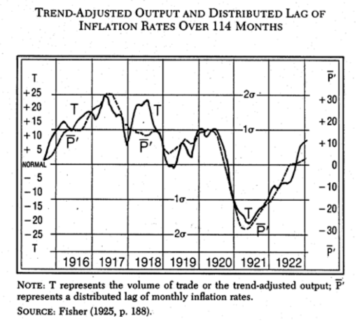
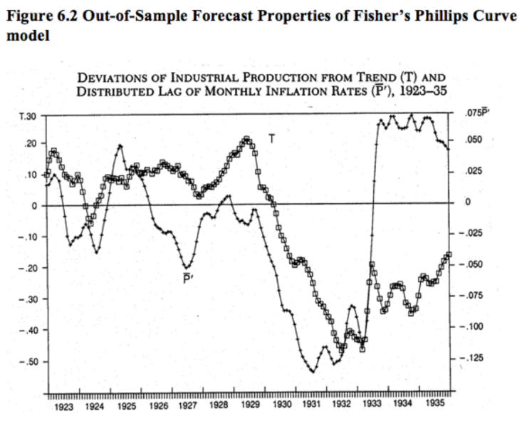
The variable P is a distributed lag of inflation, whereas T is a crude measure of real output. I then applied Fisher’s model to the period from 1923 through 1935:
Fisher’s model worked very well during 1915 to 1922, and continued to do OK from 1923-33. Then the model completely broke down after July 1933. It’s important to know why.
Instead of assuming “there’s nothing to see here”, I decided to investigate why the Phillips Curve model failed after July 1933. It turns out that in July 1933 the federal government mandated a 20% across-the-board nominal wage increase, which caused prices and output to move in the opposite direction.
The failure of the Phillips Curve model after July 1933 suggests a need to replace this simple model with a more fundamental model, such as the AS/AD framework, which allows for both positive and negative correlations between prices and output.
I am reminded of this exchange in a recent David Beckworth podcast with George Selgin:
Beckworth: But don’t we, as people who like to look through maybe an aggregate demand or nominal GDP perspective, aren’t we also invoking something similar to the Phillips curve? We invoke a short run aggregate supply curve that gets really steep going up. How different is that?
Selgin: I think it’s very different. I think that the Phillips curve takes too many shortcuts or tries to do too many things at once. That’s what a reduced form relationship basically is. I think that thinking in terms of aggregate supply and aggregate demand shifting around is closer to grasping the true structural relationships. Even though it’s not particularly complicated, it isn’t much more complicated, but it is somewhat more complicated. You have two schedules instead of one, for starters, and I think that it matters.
The model of economic sentiment discussed in my previous post continued to do well between 2016 and 2020, and then failed spectacularly. It’s interesting to think about why this happened. The Economist attributed the failure to Covid, whereas I cited increased political polarization.
Out-of-sample failures do point to a flaw in the model. But they can also provide hints as to how the model can be improved.
READER COMMENTS
Andrew_FL
Sep 26 2023 at 9:06am
What’s more plausible, that partisan biases neatly canceled out and consumer sentiment accurately and fairly assessed the economy for forty years until mean present day Republicans just decided to be that unfair to poor ol Joe, or that Consumer sentiment data has been a Rorschach Test of a mess for 45 years and nothing’s changed?
Scott Sumner
Sep 26 2023 at 12:35pm
You might want to reread my post, as you obviously didn’t understand my argument.
Reading comprehension is a big problem with some commenters.
Andrew_FL
Sep 26 2023 at 7:57pm
My point is that Fisher’s model fit to real output and the model fit to Consumer Sentiment are completely different conceptually. However crude his measures may have been, Fisher was at least measuring something that reflected the actual state of the economy. The assumption that Consumer Sentiment ever accurately tracked the economy is unwarranted, and thus the model fit was spurious.
Scott Sumner
Sep 27 2023 at 1:46pm
If that was your point, why not say so the first time? Why make up misleading statements about my post?
In any case, I completely disagree. Consumer sentiment did used to track the state of the economy—at least fairly closely.
TMC
Sep 26 2023 at 3:05pm
Taking a point from your previous post, Statistics is really hard. I read Andrew Gellman’s blog and I always find the complexity of statistics to be wild when you really get into the weeds.
Comments are closed.